
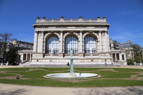
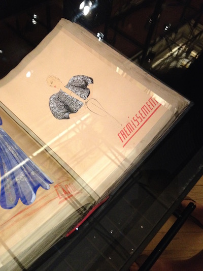
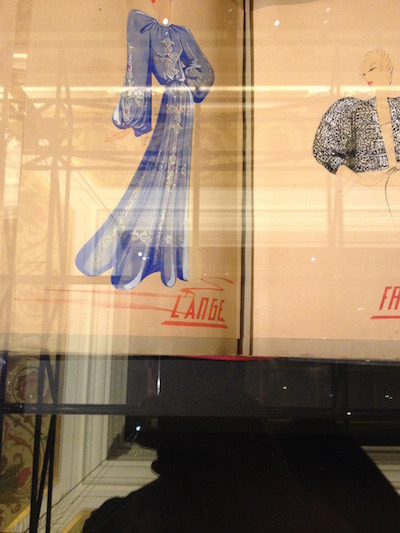
You may or may not have noticed my new logo depending on how long you’ve been visiting this website. The idea for the red-orange logo started with a visit to the Palais Galliera, the fashion museum, in Paris for the Lanvin exhibit last year. I went for the first time with my friend Alexis and I was absolutely enthralled by the clothing on display, all original designs by French Haute Couture designer Jeanne Lanvin (1867-1946). The drapey, elegant and even edgy pieces, one long black dress had metallic studs on the shoulders, were simply the most beautiful pieces of clothing I’d ever seen. I gushed over each dress and was completely mesmerized by Lanvin’s sketchbooks that were also on display. Her shimmery drawings were stunning, but what intrigued me more was the blocky orange slightly slanted lettering on the bottom of the pages. I fell in love with the typography and wanted to capture it somehow, but there was a strict no photography policy in the exhibit.
The typography (and dresses) continued to haunt me. I was planning to rebrand my website and I was throwing around a lot of ideas knowing I wanted my logo to be inspired by the more glamorous days of travel when the original Orient Express and Louis Vuitton steamer trunks were de rigueur, but one day I realized, all I wanted was Travelproper written in the same font that I saw in the Lanvin sketchbook. I searched the internet but had no luck finding it.
My dad was in Paris several months later for work and I wanted him to see the exhibit. He’s a designer and architect and I thought he would appreciate Lanvin’s artistry. I also had ulterior motives–I wanted him to see the typography in the sketchbook, so he could help bring my vision to life.
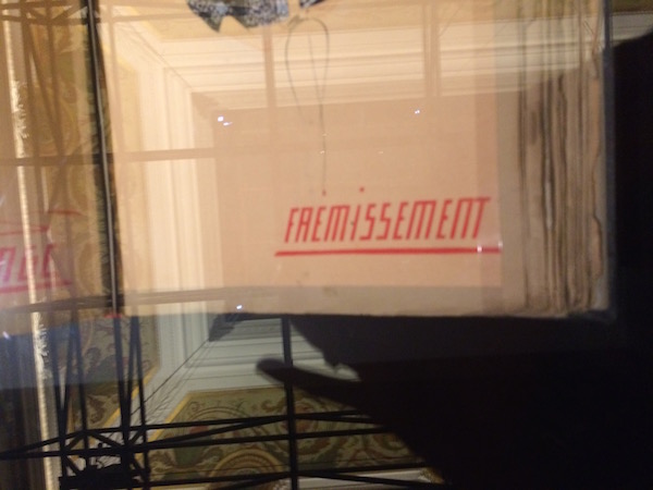
He tried to take a picture of the page with his iPhone, but he was instantly scolded by one of the women patrolling the exhibit. This only emboldened me more so the second she was gone I snapped a photo. My phone was on its last bar and afterwards it immediately shut off. My husband was with us and he slyly took several shots and we proceeded through the exhibit. Afterwards, we huddled in the gift shop and looked at the photos. They were a bit blurry because of the glass case, but they would do.
Later, I wrote a brief and sent my dad the photos. He worked with a very talented graphic artist, Dave Gill, to make this logo for me. I love that it’s not a direct copy of the Lanvin typograhy. It’s slightly more lithe and angular but it captures everything I was hoping to achieve, the glamour of the early 1900s and a forward trajectory that reminds me of the movement of travel.
During the exhibit I learned many of Lanvin’s designs were inspired by history, like Medieval dress, and her travels, two things that inspire me most. I hope this new look will help bring my vision of a travel website that explores the most authentic and stylish travel experiences to life.
I love the high tech espionage that took place to get your perfect Logo. It looks great. The back story makes it even better.